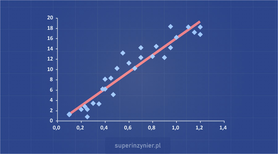
Scatter diagram
Many phenomena occurring in the reality around us are interrelated. For example:
- Human height - weight.
- Air temperature - day length.
- Welding current - weld strength.
- Force applied - part deformation.
- Load current of a power supply - temperature of a switching transistor.
- Amount of flux applied - level of ionic cleanliness.
Recognizing the relationship between variables can be very helpful in an engineer's work. By understanding this relationship, it can be used to solve a problem using for example 8D Method or Global 8D (G8D) The apparent relationship can also be an indication for further investigation of the possible causes of a phenomenon, however, it is important to remember a very important principle: "Correlation does not imply causation".
A Scatter Diagram also known as: correlation chart, correlation diagram, is one of the seven basic quality tools. It allows you to visually examine the relationship between two variables. A correlation diagram is an effective way to visualize data, especially when there is no apparent linear relationship between variables. The diagram can also be used in conjunction with statistical tests, such as correlation analysis or regression analysis.
Scatter diagram structure
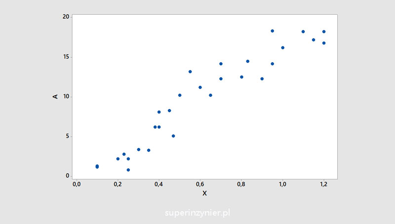
The variables whose mutual relationship will be analyzed are called "independent variable" and "dependent variable". On the X-axis (horizontal) we place the values of the independent variable, while on the Y-axis (vertical) we place the values of the dependent variable. We then plot the values understood as pairs of two variables on this graph. This creates a correlation graph that shows the relationship between the analyzed variables.
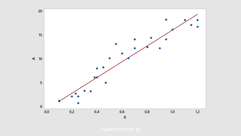
In addition, a regression line/curve can be added to the graph, the shape and slope of which represent the degree of correlation. This line/curve facilitates a better understanding of the analyzed data.
Sometimes additional categories can be introduced that can help better illustrate the results:
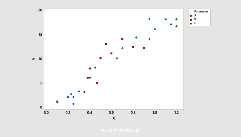
Dividing data into groups is known as stratification. For more information on this technique, see the article: Stratification
Correlation coefficient
Pearson linear correlation coefficient was developed by English mathematician Karl Pearson (27.03.1857 - 27.04.1936). The coefficient is denoted by the symbol "r" and can take values from -1 to +1. The closer the value is to +1 or -1, the stronger the correlation, the closer the value is to zero, the weaker the correlation. The coefficient is useful when the variables have a normal distribution and the relationship is linear.
If the analyzed variables do not have a normal distribution or do not have a linear correlation, other formulas can be used, such as Kendall's tau coefficient, Spearman's coefficient, Gamma statistics, etc.
Examples of correlations
Positive correlation
The value of the dependent variable (Y axis) increases as the value of the independent variable (X axis) increases. The correlation coefficient is positive. The closer the correlation coefficient is to +1, the stronger it is.

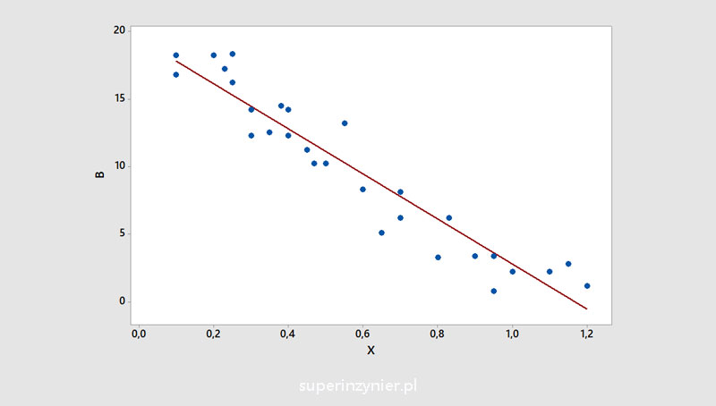
Negative correlation
The value of the dependent variable (Y axis) decreases as the value of the independent variable (X axis) increases. The correlation coefficient is negative. The closer the correlation coefficient is to -1, the stronger it is.
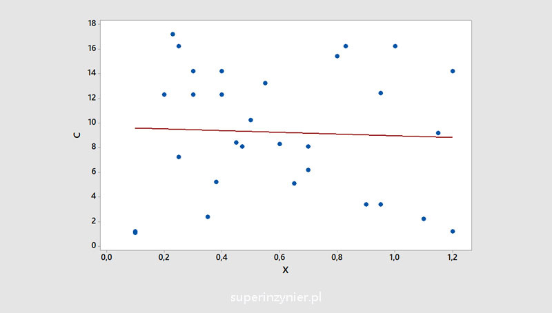
No correlation
A situation in which there is no relationship between two variables. The correlation coefficient is close to zero.
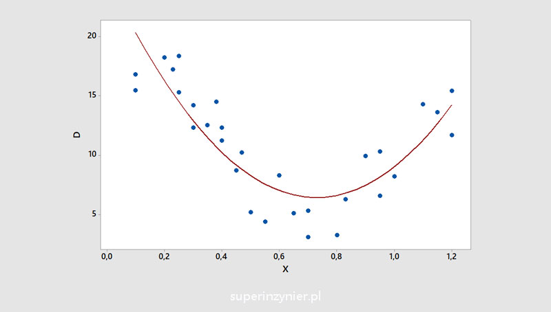
Nonlinear correlation
The dependent variable (Y axis) changes its value relative to the independent variable (X axis) in such a way that once the value of the dependent variable (Y) rises and once it falls. Pearson's linear correlation coefficient will be inadequate in such a case and usually close to zero. Examples of nonlinear correlation:
Typical issues
Too much data
The very large amount of data plotted on a graph can lead to difficulties in assessing correlations based on points alone.
Too little data
Too little data may not be enough to correctly assess correlation. If we are dealing with a phenomenon where correlation is weak or absent, a small amount of data can mislead us. We may "notice the correlation" despite its actual absence. Below is an example showing the absence of correlation (left graph) and the illusory correlation, in the case of a small amount of data from the same set of results (right graph).

Outliers
Outliers are data that "do not fit" with the rest of the observations analyzed.
Outlier observations typically arise due to measurement errors, "typing errors" during manual recording of results, or other unusual events. Some statistical methods are not very robust to the occurrence of outlier observations, especially those assuming a normal distribution or linear relationship. Linear regression and Pearson correlation are very sensitive to the occurrence of outlier observations.
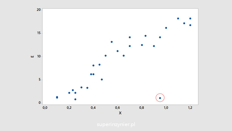
If such an observation occurs, it is necessary to check what could be the cause. Usually, such an observation is removed from the dataset, and the correlation coefficient is then recalculated.
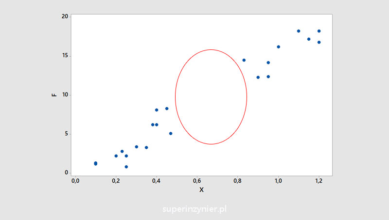
Missing data
Observing the scatter diagram, we can sometimes notice missing data, which can affect the evaluation of correlation. It is necessary to check the reason for the missing data, because sometimes we can get only part of the results (e.g., only non-conforming test results from a dataset of all measurements).
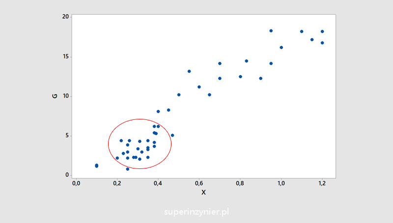
Data clusters
The chart may show areas with more observations, which can be seen as data clusters. As with missing data, it is worth checking the cause, such as how the measurements were taken.
Correlation vs. causation
A scatter diagram is a useful technique for examining the relationship between two variables, but always remember that correlation does not imply causation.
What does it mean?
It means that if we see a correlation between two variables, it does not mean that there is a causal relationship between them. Thus, the dependent variable (Y) may not be caused by the independent variable (X) and the observed correlation may be due to other unknown causes. This is a very important rule, unfortunately often overlooked when analyzing data.
Below is an amusing example of a strong correlation: The number of non-commercial space launches worldwide relative to the number of sociology PhDs awarded in the US.
From the chart above, can you conclude that the number of PhDs in sociology in the U.S. is affecting the growth of non-commercial spaceflight around the world?
Bottom line: when seeing a correlation, let's not jump to conclusions about the causes of the phenomenon..
Tools
The scatter diagram can be developed on a piece of paper :), in a spreadsheet, in data analysis software (e.g. Minitab) or using tools such as Phyton or R.
Summary
The scatter diagram facilitates the analysis of data, allowing a better understanding of the relationship between the analyzed variables. With the help of the diagram and the evaluation of correlation coefficients, it is possible to assess the possible influence of individual variables, look for possible causes and improve processes and, consequently, improve products.
When using a scatter diagram, always keep in mind that the analyzed data may be incomplete, may contain outlier observations, which can affect the results. It is also important to remember a very important principle: "Correlation does not imply causation". This approach will help to draw correct conclusions.


